What It Is & Why I Developed It
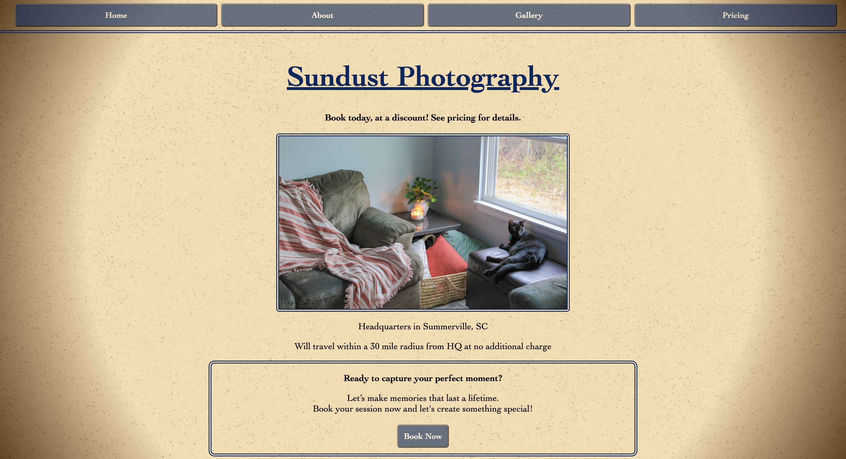
This is a website that I built for Derek Riley, a freelance photographer (and also my husband). It is a professional website to help attract customers, allow them to see his work, and allow them to book a session easily. It includes a Home page, an About page, a Gallery page, and a Pricing page.
Key Home Page Features:
- Call to action at the top
- Some information about where Sundust Photography is located, as well as traveling distance
- A "Book Now" button, which opens up an email draft addressed to sundustphotography@gmail.com
- A changing image in the center, which loops through 5 images. Clicking the image takes the user to the Gallery page.
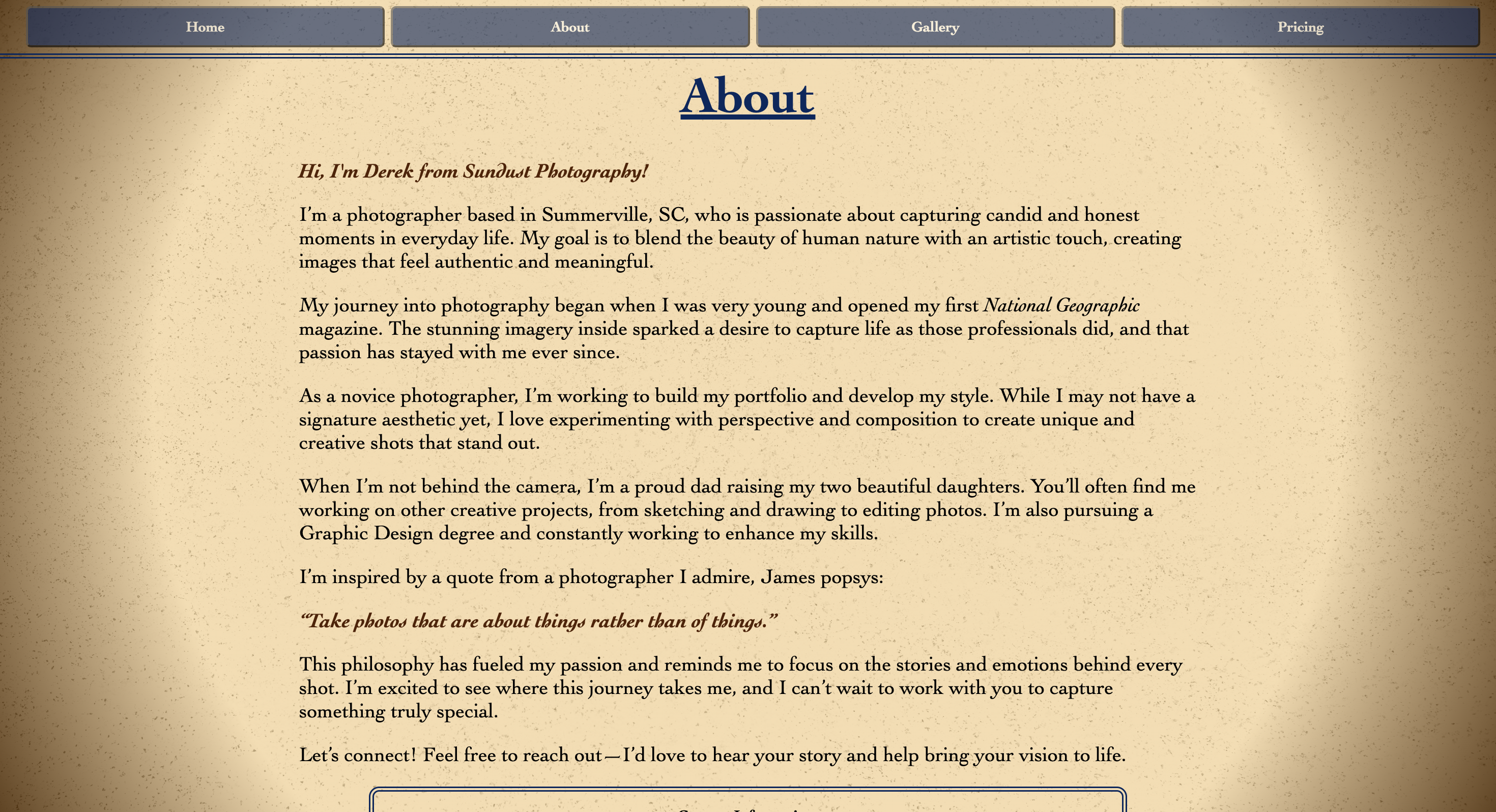
Key About Page Features:
- A few paragraphs about who he is and why he does photography
- Contact information at the bottom of the screen
The About page contains information all about who Derek is and why he chose to get into photography. It provides a sense of personality, like there's a real human on the other end of this website, and allows the customer to get a feel for who they're hiring. The bottom of the page includes contact details (phone number and business email) to, again, allow the customer to quickly and easily get in contact.
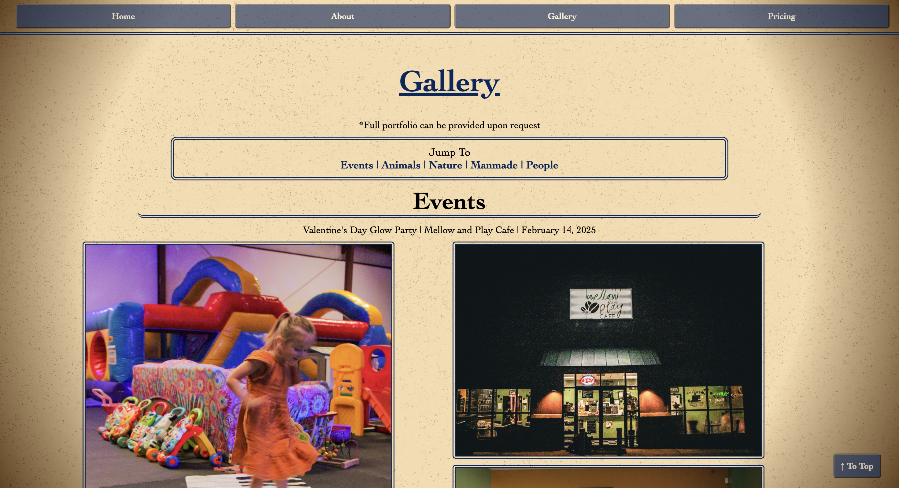
Key Gallery Page Features:
- A Jump To section that allows the user to skip to any category. This is helpful because it saves the user from having to scroll down past dozens of images.
- A To Top button that takes the user back to the top of the page, so they may choose a different section to visit.
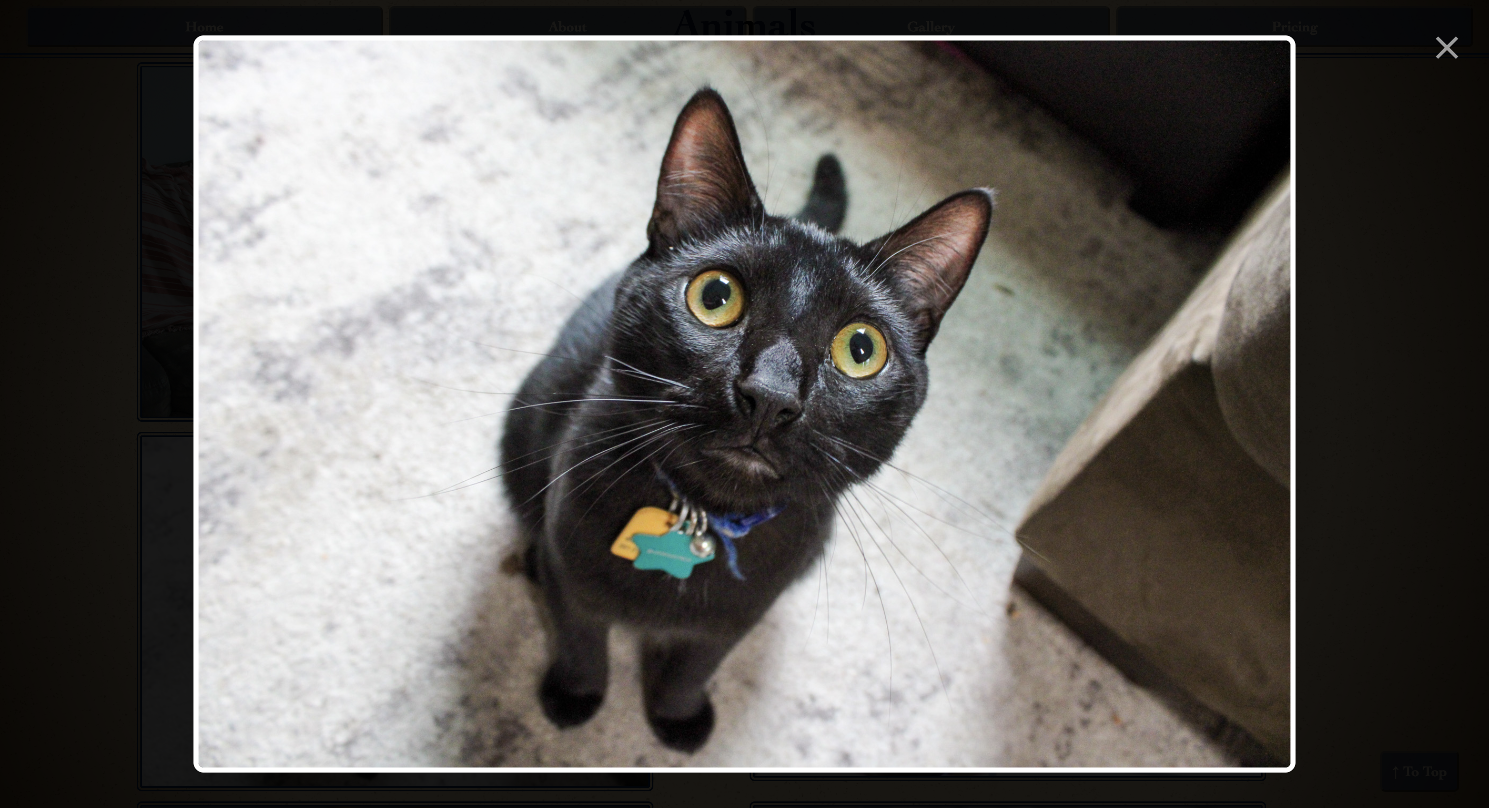
- Images that expand when clicked and shrink back down when a close button is clicked.
The Gallery page was my favorite to develop and I'm very proud of it. It includes all sorts of examples of his work, divided into 5 categories: Events, Animals, Nature, Manmade, and People. Clicking on any section title in the "Jump To" section will skip to that section. I added this so that if someone, for example, wants to view the Nature section, they don't have to scroll through two other sections to get there. Similarly, I added a "To Top" button to bring the user back to the top of the page to select another section, rather than scrolling all the way back up. This streamlines and improves the experience for the user.
Each image in the Gallery page is clickable and clicking on any image will expand it so that it can be seen more closely or viewed on its own without the visual clutter of the other images. When an image is expanded, a close button also appears, to allow the user to shrink the image back down and keep scrolling. Hovering over an image shows a white box-shadow to let the user know that it's a clickable item.
Key Pricing Page Features:
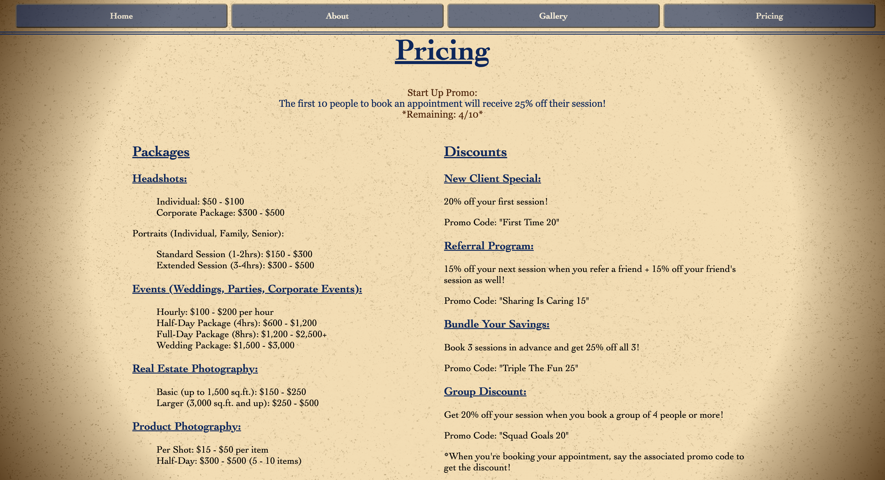
- Pricing for different packages and categories of photos (headshots, events, real estate, ect.)
- Information about discounts and add-ons
The pricing page clearly outlines the different photo and session packages that are available, as well as their pricing. This provides some transparency to the customer and streamlines the experience because they don't have to do any extra legwork to obtain the information. The customer can see right away whether Sundust Photography is within their budget. The Pricing page also includes a list of promo codes that can be used when booking an appointment.
Key Design Elements:
- Background is a radial gradient, intended to look like a ring of light. Background uses warm inviting colors and is a semi-transparent gradient over an image of film grain, for texture.
- Text and buttons are a shade of blue that compliments the background color.
- Hovering over a button causes it to transition to a lighter shade of blue. Clicking on a button does the same.


How I Did It
- Set Up The Repository & Domain
- Gather Requirements
- Design
- Front End
- Back End
I created the repository in GitHub and cloned it in VS Code so that I could use GitHub for version control. GitHub Pages is also my chosen hosting platform for this website, as it's free, enforces HTTPS, and allows me to update my website directly from the repository. The domain was bought via Network Solutions and is hosted as a custom domain in GitHub pages.
I spoke with the client to determine what he wants to see in his website. He used words like "cozy" and "neighborly" to describe the feel he wanted the site to have. We also discussed which pages he would want on the website and what sorts of functionalities he wants it to have.
First, I looked up some mood boards on Pinterest, using keywords like "cozy" and "neighborly". Next, I used Google color picker to find some hex codes for colors that I would potentially use for this project, based on the mood boards. I decided on the sepia and blue color scheme because it has a cozy vibe and the blue really compliments the orange in the sepia.
Next, I put together some wireframes to show to the client, to get his approval on the layout of the pages. I also showed him the color scheme and used Google Fonts to choose some fonts together.
I began by creating HTML files for each page of the website. Then, I created corresponding CSS files and one overarching Styles.css file. Styles.css handles styles that apply to the entire website, such as the background and button colors. The CSS files for each page only handles styles that are specific to that page.
Next, I pasted in HTML boilerplate code from a boilerplate.html file that I keep on my device for when I want to create a new HTML file. It saves me from typing out the same things over and over again to create the basic structure of an HTML page.
Once each page had its boilerplate code, I went through and added actual elements to each page such as text, buttons, image boxes, etc. I styled each element as it was created, as this is my preferred method.
The back end for this website mainly consists of JavaScript for the Gallery page. I had never created an expanding image effect like this in JavaScript before. I had created one in Kotlin before, for an Android app assignment in college, but never for a website. Since this was new territory, I began by researching how to do it.
Once I had consulted a few resources online, I began using a combination of CSS and JavaScript to produce the expanding image effect and the close button that appears when the image is expanded.
JavaScript is also used to create the changing image on the Home page, cycling through an array of images and changing every 3 seconds. There is an event listener on the image container so that when the image is clicked, it takes the user to the Gallery page.
What's Next
What I'll Be Adding in the Future
- A form where users can fill in their contact information and a message if they prefer not to use the Book Now button.
- Testimonials on the Home page.
- Social media links